How It Started.
When I arrived at Nacelle, the team was relatively small at 35 people, there was no formal UX practice, and they had a dashboard that could best be described as functional. The user experience was full of problems that were bubbling up and these issues were keeping Nacelle from retaining and expanding their merchant portfolio. My 30/60/90 was devoted to learning the industry, the business, and the challenges so I could create a plan to intertwine UX with our engineering efforts and move the needle on providing a better experience.
After spending time working with various stakeholders, chatting with some of our most trusted customers and reviewing our product, I identified two primary concerns:
1. POOR PRODUCT UX
Nacelle built an underlying technical foundation for connecting PIMs and CMSs and normalizing the data, but the process to do so was cumbersome and required engineers on the client side. The initial dashboard was a small help, but was too convoluted and unreliable for non-technical users. We needed to build a dashboard that allowed for a more seamless experience with using our underlying tech while also giving non-technical users the ability to validate and fix data issues.
Nacelle built an underlying technical foundation for connecting PIMs and CMSs and normalizing the data, but the process to do so was cumbersome and required engineers on the client side. The initial dashboard was a small help, but was too convoluted and unreliable for non-technical users. We needed to build a dashboard that allowed for a more seamless experience with using our underlying tech while also giving non-technical users the ability to validate and fix data issues.
2. UNSURE OF HOW TO LEARN
While Nacelle had a base understanding of what the product should foundationally be, they were unsure of the best ways to test new ideas and leverage the dashboard as a greater value add.
While Nacelle had a base understanding of what the product should foundationally be, they were unsure of the best ways to test new ideas and leverage the dashboard as a greater value add.
How I Addressed the Problems
1. AUDIT THE EXISTING DASHBOARD
Find the low-hanging fruit we could address so there were no disruptions in our service to merchants. The goal was to improve the experience with a Pareto Principle mindset so we could get some quick wins.
Find the low-hanging fruit we could address so there were no disruptions in our service to merchants. The goal was to improve the experience with a Pareto Principle mindset so we could get some quick wins.
2. CREATE A DESIGN SYSTEM
Create a design system so we could quickly ideate at a fidelity that closely resembled what he end product would be. We also did wires and flowcharts and other such ideation work in tools like Miro, but ultimately for the sake of speed and prototyping it made sense to optimize our UI flow with a design system that was shared with front-end.
Create a design system so we could quickly ideate at a fidelity that closely resembled what he end product would be. We also did wires and flowcharts and other such ideation work in tools like Miro, but ultimately for the sake of speed and prototyping it made sense to optimize our UI flow with a design system that was shared with front-end.
3. SHIFT THE FOCUS TO OUR USERS
Take a step back and address our problem statements so we could reframe the problems as job stories and shift the focus to outcomes rather than being so task-driven. Further, we needed to take this framing and ideate with it in mind before considering trade-offs and implementing solutions. This paradigm shift necessitated prioritizing our users and required us to meet with them early and often to keep them at the center of everything we did.
Take a step back and address our problem statements so we could reframe the problems as job stories and shift the focus to outcomes rather than being so task-driven. Further, we needed to take this framing and ideate with it in mind before considering trade-offs and implementing solutions. This paradigm shift necessitated prioritizing our users and required us to meet with them early and often to keep them at the center of everything we did.
4. INTEGRATE UX EARLIER IN THE PROCESS
Integrate UX earlier in product conversations so we could leverage the real value of UX: designing potential solutions that consider user, business, and technical inputs so we can decide on the right path forward and understand all trade-offs involved. Too often, design is brought in after business and technical decisions have already been made which removes the real value UX can provide in building the right thing (and then helping with building the thing right).
Integrate UX earlier in product conversations so we could leverage the real value of UX: designing potential solutions that consider user, business, and technical inputs so we can decide on the right path forward and understand all trade-offs involved. Too often, design is brought in after business and technical decisions have already been made which removes the real value UX can provide in building the right thing (and then helping with building the thing right).
5. EVALUATE AND LEARN
Test our designs and flows in both moderated and unmoderated scenarios. For unmoderated testing we used Maze, whereas for moderated testing we used Zoom and had an interviewer, a notetaker, and an engineer to hear firsthand from our merchants.
Test our designs and flows in both moderated and unmoderated scenarios. For unmoderated testing we used Maze, whereas for moderated testing we used Zoom and had an interviewer, a notetaker, and an engineer to hear firsthand from our merchants.
1. Audit the Existing Dashboard
The screenshots below show the initial state of the dashboard. As evidenced below, the product had a weak IA, an unclear navigational structure, no real direction on what actions a user can/should take, a UI that felt quite dated, and no attention paid to basic Gestalt principles.
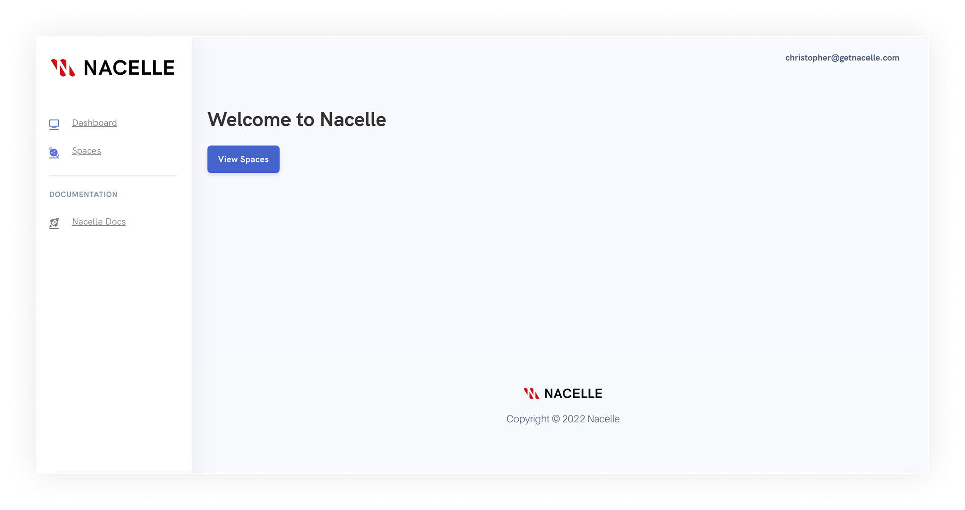


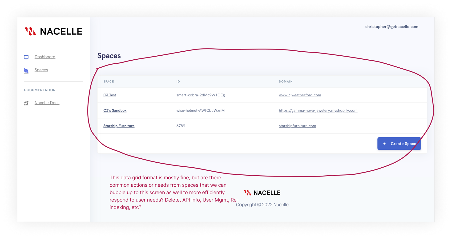

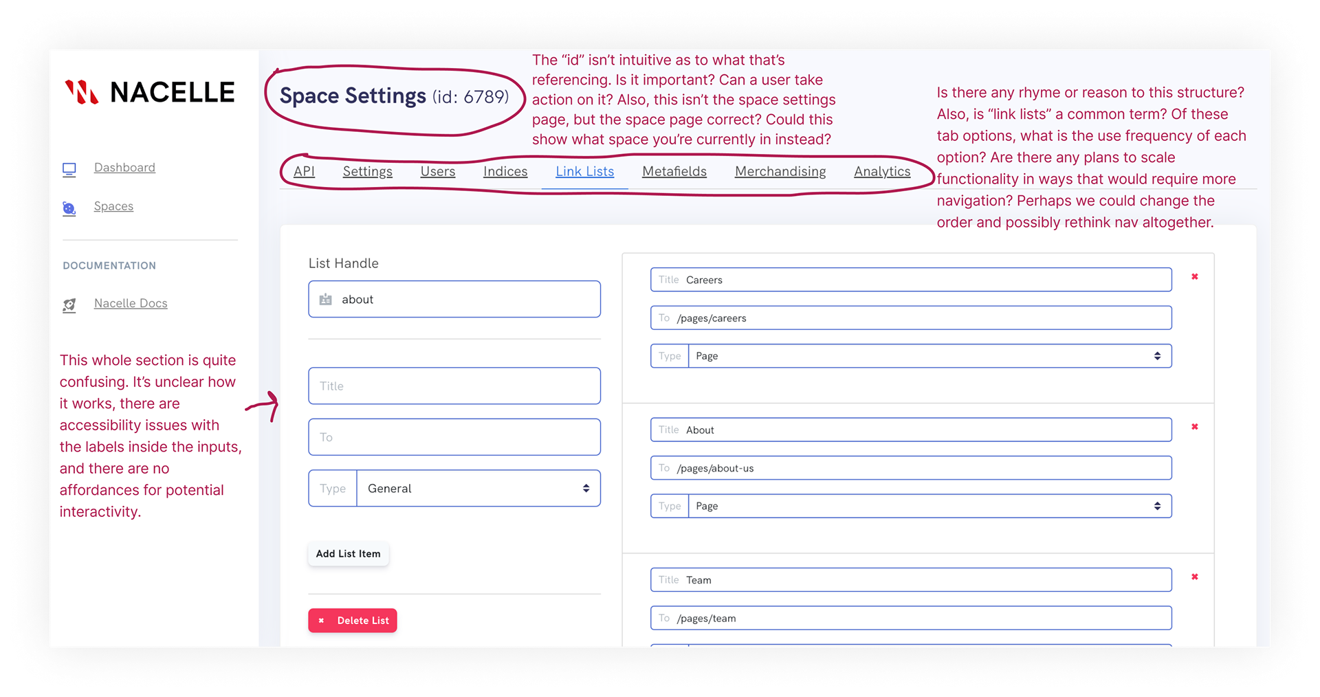
Conducting an audit early in the process helped with a few things. Namely, it gave me an opportunity to learn more about the product, our market, our users, and our business. Running the audit consisted of doing a deep dive into every screen and interaction, map out the journeys, discuss the desired outcomes with our users, understand trade-offs that were made between implementation and design decisions among other activities that served as descriptive, generative, and evaluative research. The audit served as a fantastic way to set a foundation for UX within the company.
Two direct and immediate results of the audit were producing a set of basic changes we could have our front-end team make while we, the UX team, took the details of our audit to the drawing board so we could begin our process of improving the UX from the ground up. Among our recommendations were to:
1. Give clearer affordances of what kinds of things a user can do in the dashboard. This also has the side-effect of giving users a sense of control that is otherwise lacking.
2. Include CTAs for first time users who do not have their data loaded into our system yet. This gave them an immediate action they could take from any screen, thus removing the cognitive bumps that come from not knowing what to do.
3. User clearer language that can be more readily understood. There was a temptation to create new terms in an effort to “differentiate” Nacelle from the market, but this came at the expense of understanding for our users. We worked with our engineering managers and sole PM on prioritizing usability over differentiation with regard to content in the product.
4. Re-organize our tab navigation to display from most-utilized to least-utilized functionality, and for us to land on the page we knew to be used in over 90% of user sessions.
2. Create a Design System
At this moment in the UX and product design world, it has become all but a necessity to create a design system to expedite UI while maintaining consistency and making handoffs between design and development much smoother. In this spirit, I led an effort to create our own design system that could be iterated upon over time.
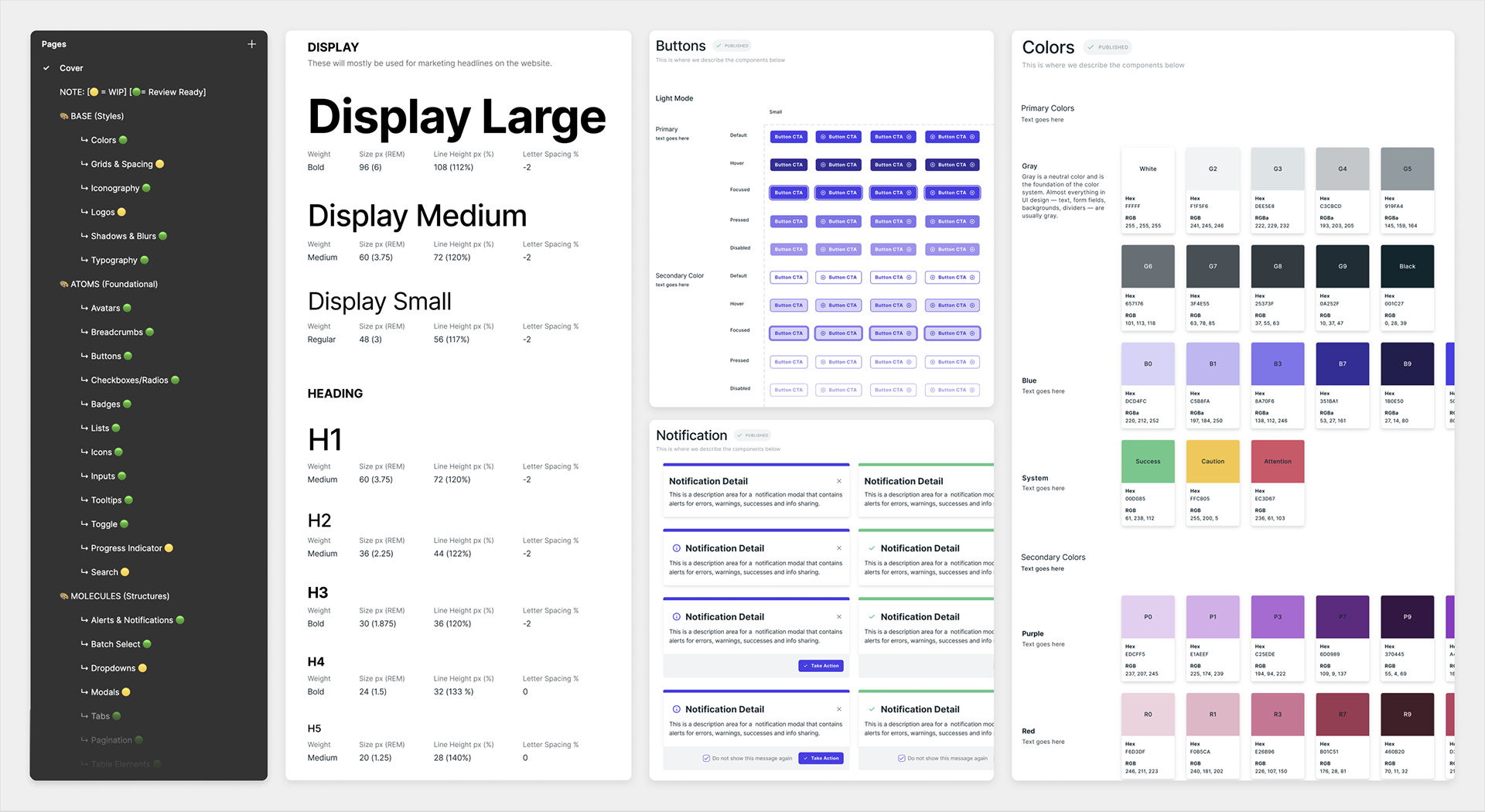
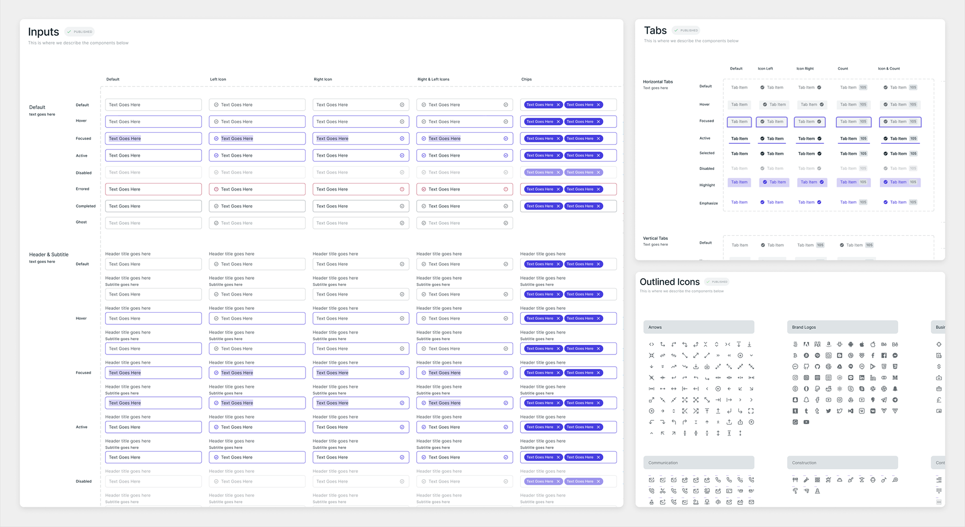
Our design system, named the “Uhura Design System” after Nyota Uhura from Star Trek, used an atomic approach to components. This allowed us to spend more time working in a fidelity that closely mirrored the product that will be delivered, and allowed us to do so at roughly the same speeds as traditional wireframing. Further, we were able to better collaborate with product, engineering, and other partners throughout the company on discussing, exploring, and delivering our product. Below is a sample of the types of items contained in our design system.
3. Shift the Focus to Our Users
The following is a behavioral example of the types of UX and outcome-focused work I did. This is a granular, mini case study of a specific problem within the broader Nacelle platform.
A necessary and complex part of our platform was the management of users and organizations, especially given that we also had to accommodate agencies who needed access to multiple organizations. Our engineering team had already planned a potential solution, but after further evaluation exposed multiple UX issues, we ended up creating an alternative that was mindful of technical constraints but was more cognizant of user needs.
I was initially asked by the engineering squad responsible for this work to look over their solution and see if it made sense. One of the immediate and most fundamental mistakes I noticed is the way the team framed problems. The framing of problems prior to UX involvement emphasized the potential tasks that were involved with creating accounts, creating spaces, inviting members, etc. Though understanding and accounting for tasks are crucial, there was no prior work done to understand the mental models, flows, and in situ contexts for our users so we could account for the best flows prior to detailing the tasks and steps involved. Another ongoing problem was the tendency to focus on features and tasks in isolation from the whole of our system. We would commonly create scenarios where we'd solve a specific task, but do so without consideration for the broader goal. In practice, the approach engineering took prior to UX and how that contrasts with the approach we ultimately ended up taking is best shown by contrasting "user stories," which tend to be task-based, with "job stories," which emphasize the context, motivations and desired outcomes of the user.
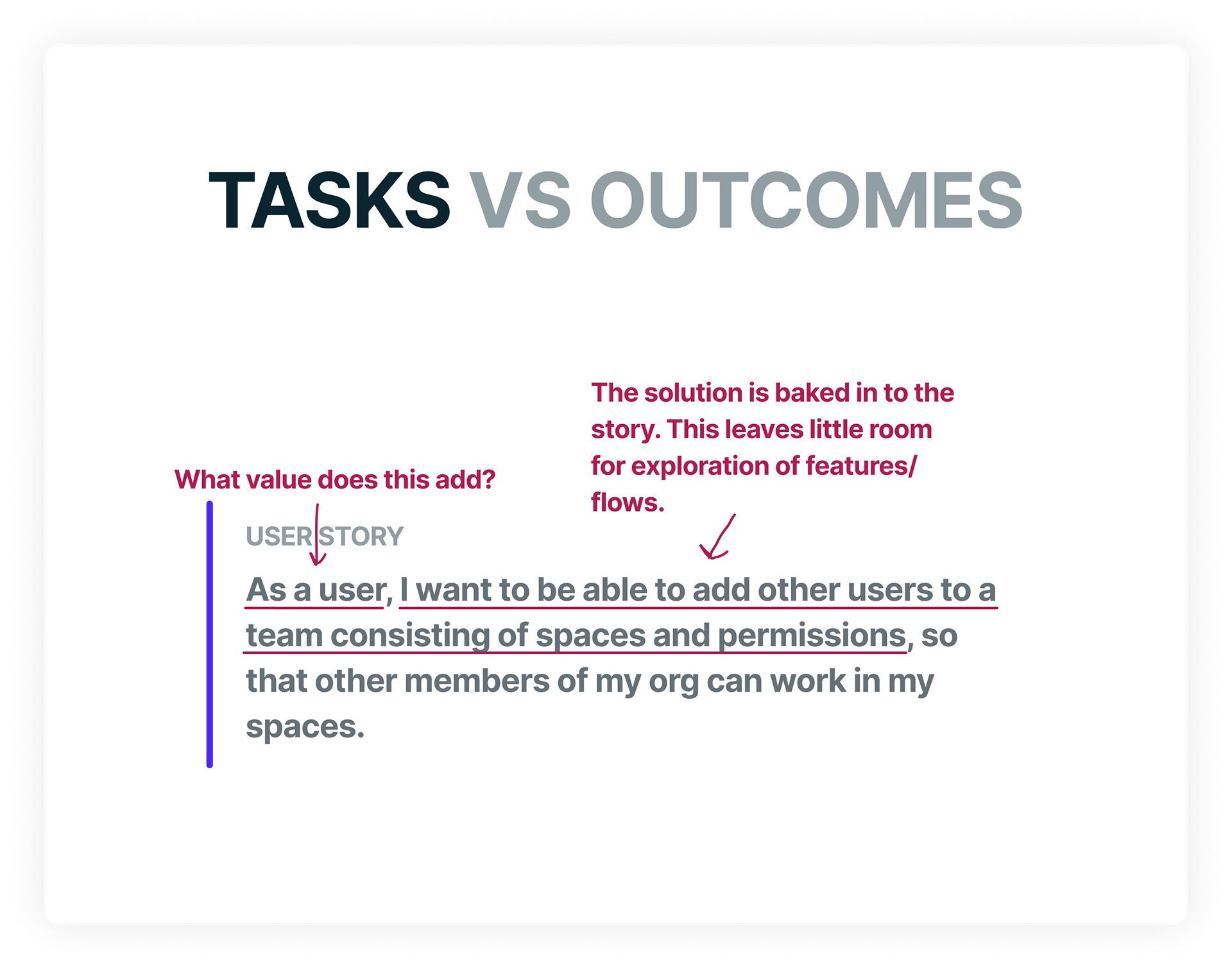
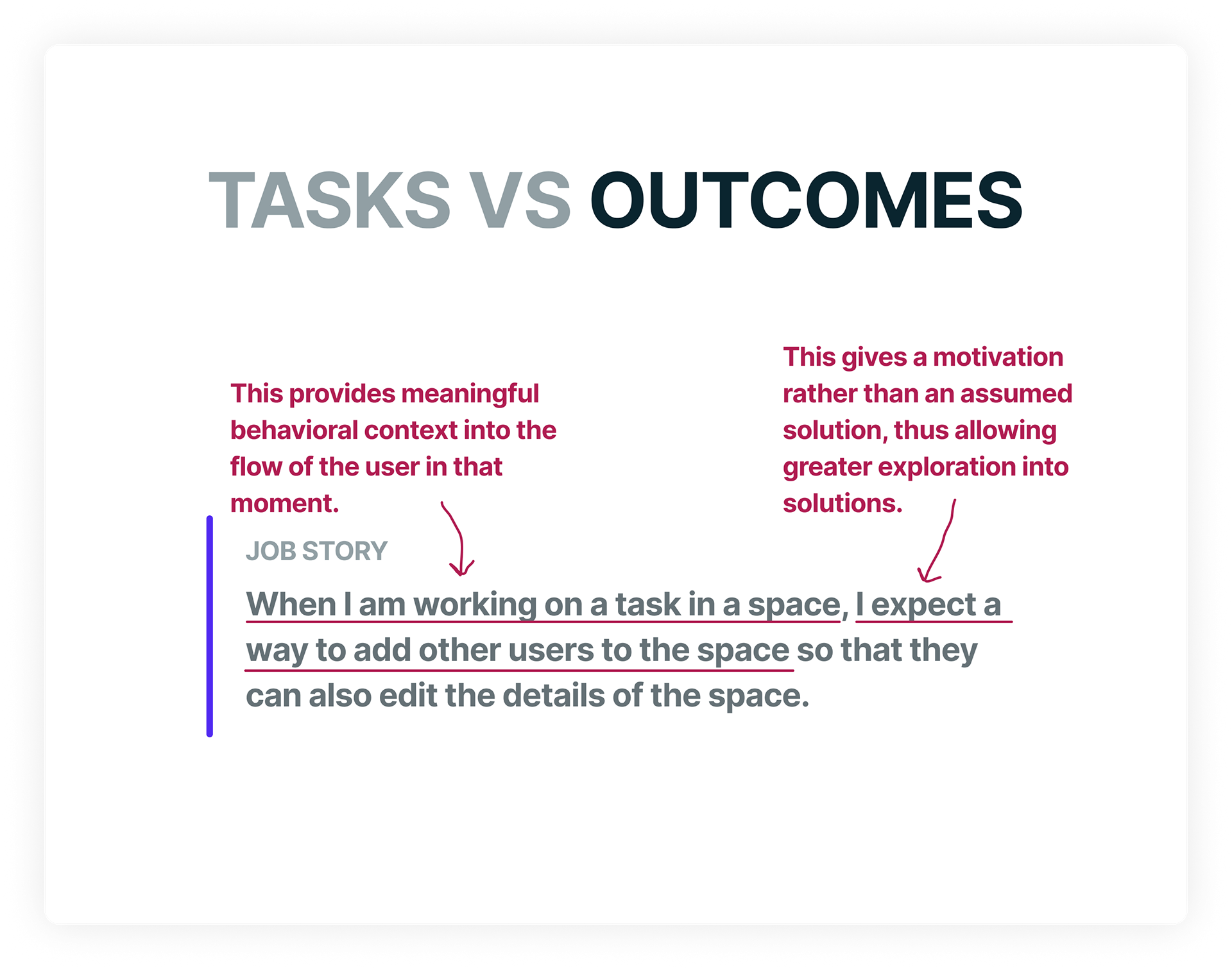
In my career, I've found the user-story framing to be better suited as a tool for implementation work in which tech teams need explicit feature descriptions to facilitate technical stories. When used in those conditions, they are fine for the job (though I'm still unsure about the "as a user" portion). But when extending user stories – and by extension, user story mentality – beyond this scope, you risk reducing the user and their jobs down to narrowly defined features which may or may not understand the context and desired outcome/s of the user. Framing the problems of users in formats with questionable inputs and baked-in solutions inevitably leads to disjointed experiences which may or may not result in desired outcomes. By addressing how we frame problems, and thus what we prioritize when product-building, we open ourselves up to better explorations based on real-world understanding of our users. Job stories necessitate that we understand our users' contexts and desired outcomes. When used in earnest, this means we spend more time talking with users, ideating on how best to serve them, and auditioning various solutions that balance user needs, technical feasibility, and business goals.
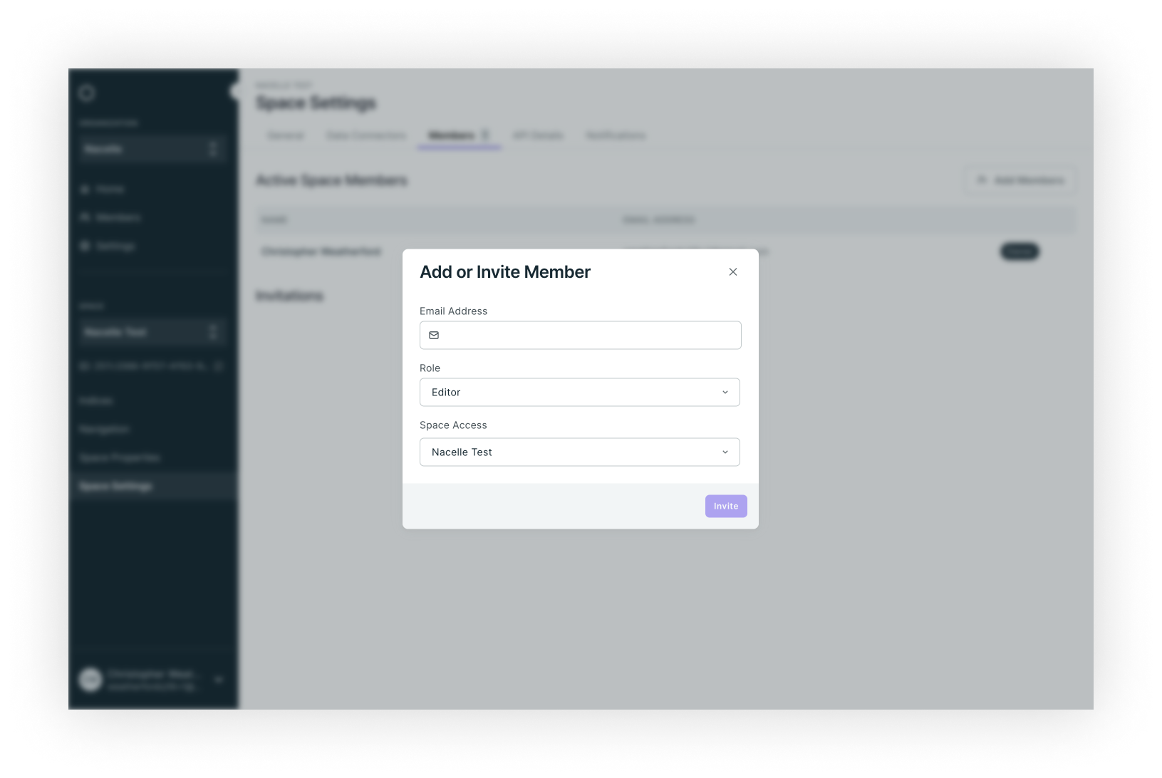
So how did the above play out with regard to our organizational structure work? Our engineering team initially created a way for users to add other users to workspaces within an organization by creating a “teams” concept, with a “team” being the combination of a set of spaces with predefined user roles. But it was engineered such that the “team” concept mediated all relationships within an organization. This meant that, for McKenzie to invite Jon to space A as an editor, Mckenzie had to invite Jon to a team that already had space A in it with an "editor" user role set as the permissions for that team. In other words, there was no way for McKenzie to invite Jon directly to space A as a specific user role without A) knowing if such a “space/permission” combination already exists and B) knowing which team contained that combination. Further, it required the additional administrative step of creating a team that contained the proper “space/permission” combo if one didn’t already exist. That’s a lot of work for a user in the middle of a flow who simply wants to quickly add Jon so he can assist with what she’s currently doing. In the equation of Tesler's Law, this meant that we favored ease of implementation over usability.
Below is a diagram expressing how users would be added to a workspace:
After meeting with the team to understand the context and what led to their solution, I met with our PM and CEO to see if we could extend the timeline a bit so we could take a step back to better understand how we needed to approach this work for our users. With an additional two weeks secured, I went to work chatting with a few of our users, three of whom were merchants and one of whom represented an agency using our product for their clients. I documented the various scenarios that occur and how that compared to more desirable outcomes so I had a gap to explore. But I also had to factor in that we were wanting to shift our product to accommodate an enterprise customer profile moving forward. So to cover blind spots of not currently having customers of the size we wanted, I did a comparative analysis of a few best-of-breed solutions within the eCommerce space to discover what kinds of features are ubuiquitous, where products differ from one another, and borrowed some ideas to inform our own solution.
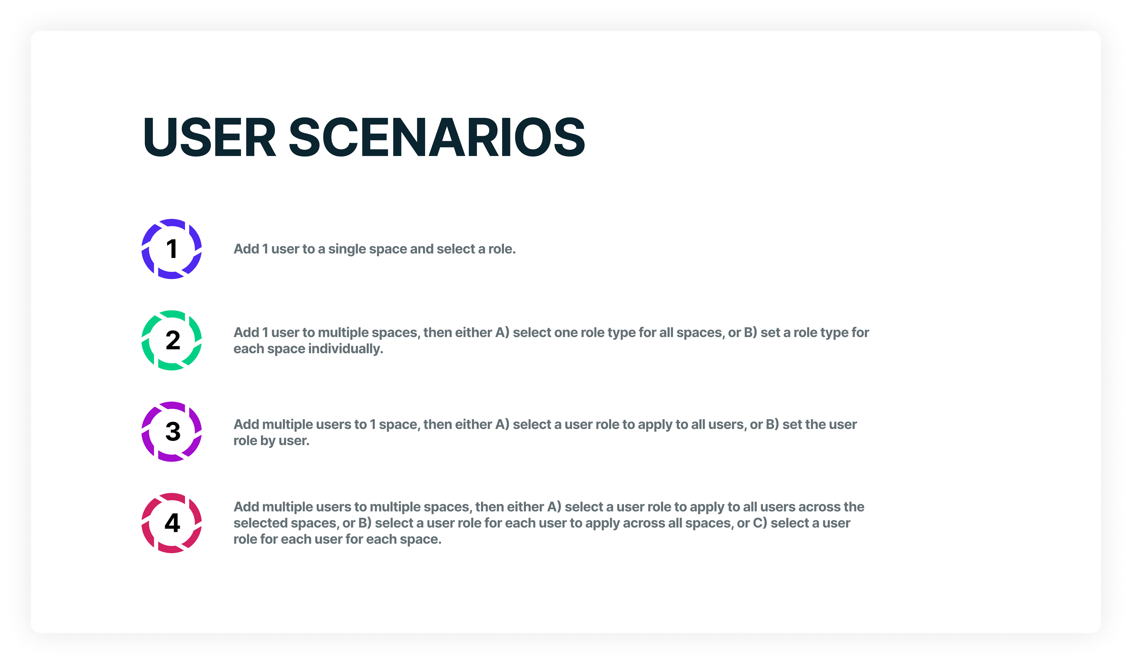
As my research was taking shape, I used this work as a foundation for creating job stories and scenarios we needed to consider with our solution. The following images show the primary scenarios after the above research was conducted:

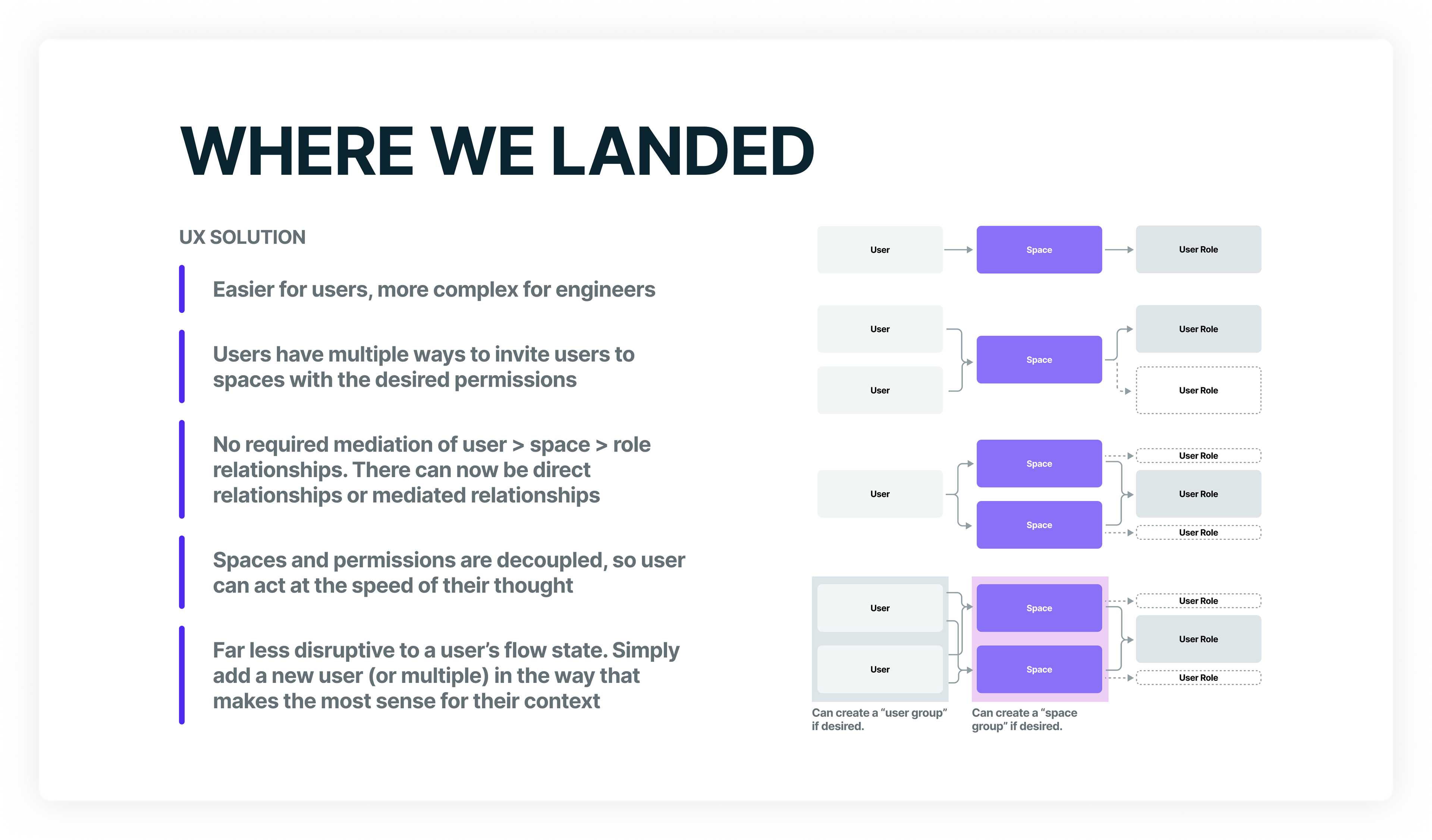
With the above context, research, and problems in hand, we began creating solutions that better balanced usability with technical feasibility. Initially, my mentee and I worked both independently and collaboratively on potential designs before pulling in our engineering team who were tied up with multiple other endeavors. When we felt like we were in a good spot to present viable designs to users, we met with engineering to discuss the solutions and their feasibility in an effort to ensure we could build what we were proposing and evaluating.
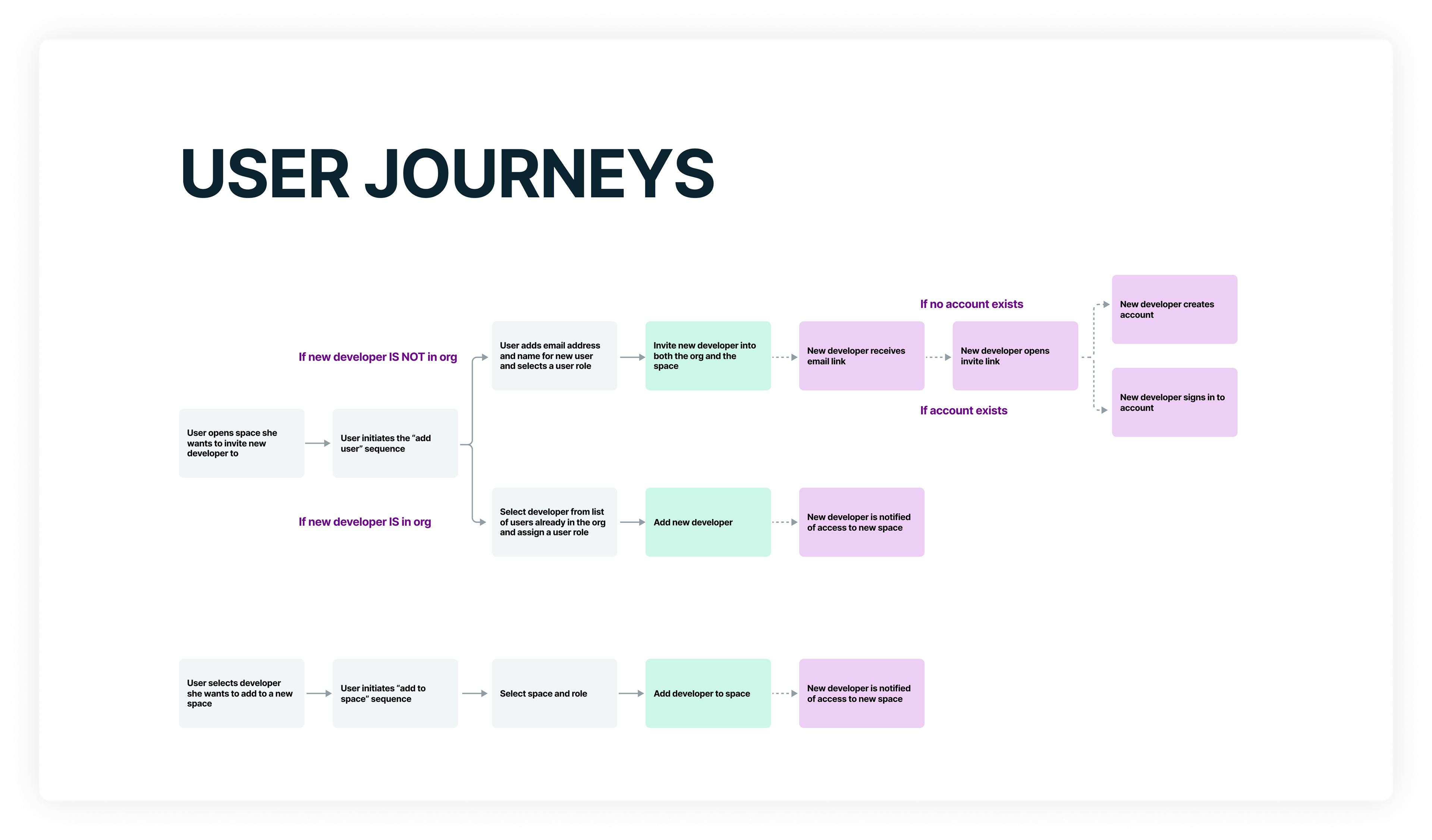
Sample of a journey for us to consider when designing
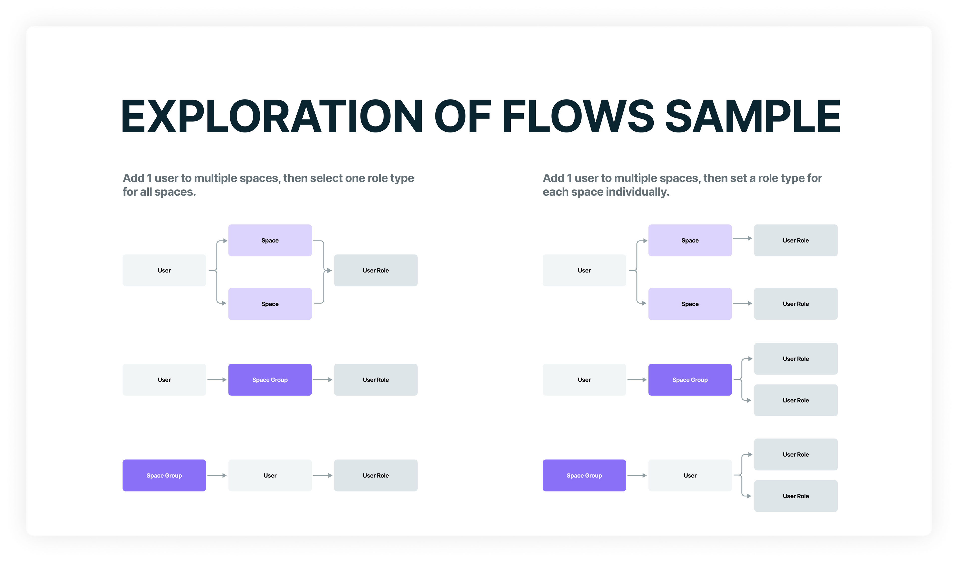
How relationships would be created between users, spaces, and role types

This is one of the bread and butter values of having UX earlier in product-building cycles: considering tradeoffs between various solutions to select the best path forward before building in code.

Earlier phase explorations in Miro

Explorations moved to our design system when basic flows were established
After a few iterations based on conversations between UX, PM, and engineering, we built out flows for our primary scenarios and conducted both moderated and unmoderated usability testing. For moderated testing, we used Zoom and I organized a two person team of me and my mentee to conduct the tests. We gave a link to a Figma proto to the participant, and I asked them to conduct a few tasks so we could monitor behaviors and ask qualitative questions along the way. For unmoderated testing, we set the protos up in Maze and sent a link to participants. Each method has trade-offs, but the big picture either way is for us to account for behaviors as accurately as we can and ensure we have a qualitative understanding for the displayed behaviors. As I learned in my anthropological background, the real gold is in the gap between what people say and what people do. In product-building, that gap is where we discover if there are usability, desirability, or value concerns with the feature.
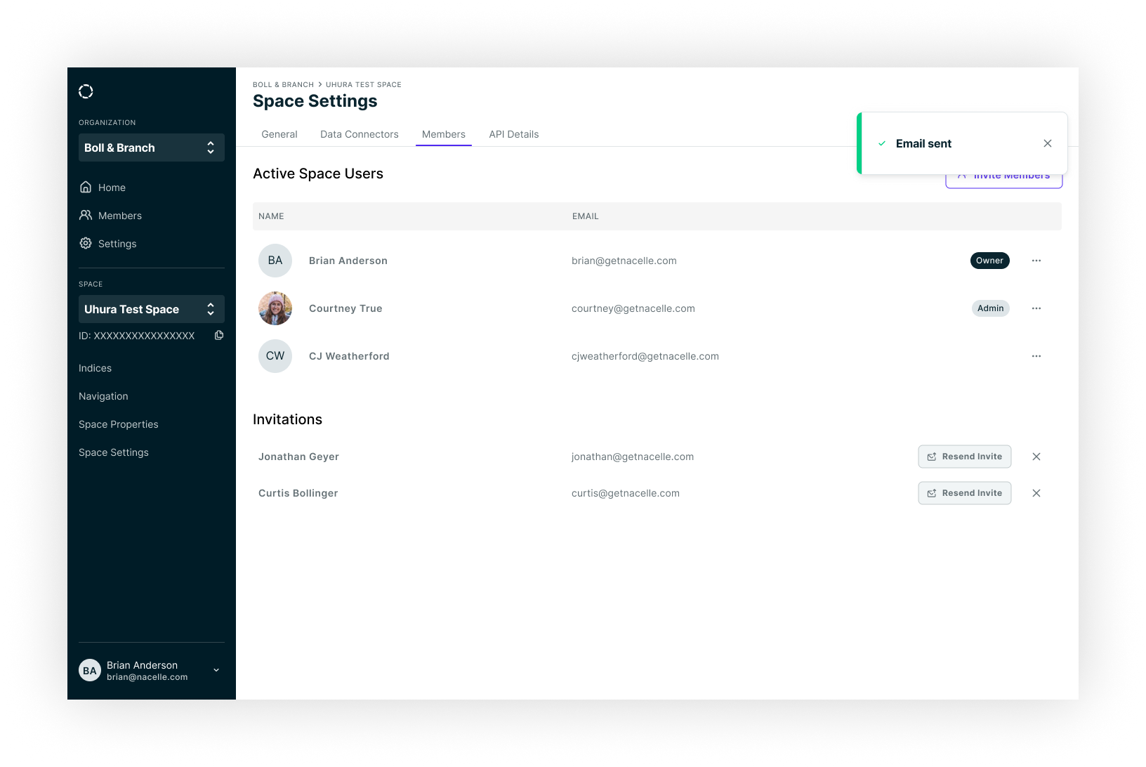
Once we had a series of favorable designs that performed well in testing, we crafted a plan on how we would release the designs so we could still build toward the minimum valuable product and learn more as these designs made their way into the real world. Because our approach shifted to optimize for usability over ease of implementation, it became impractical to build everything at one time, so a release plan made sense. By the time I parted ways with Nacelle, we had implemented all four primary scenarios and received overwhelmingly positive responses from both our agency partners and our merchants. There was now more flexibility and capability for them to truly operate as an organization within our product, and the scenarios had a high level of discoverability and ease of use. We did find that there was still room for further improvement by adding in features that augmented and automated some of the more common scenarios, but UX had already addressed many of those concerns with solutions that simply hadn't made it into sprint planning yet.
4. Integrate UX Earlier in the Process
Whereas the previous section focused on the craft of UX, this section focuses on the organizational dynamics that senior designers and leaders are often confronted with when trying to shift the paradigm of a company. While an ideal world would allow for designers to focus purely on craft and advancing the business through helping users directly, the reality is that designers have to spend a significant portion of their time fostering a culture that values a design mindset. This is arguably as hard, and often times harder, than the actual hands on UX work. This was no different at Nacelle.
The above case study serves as a perfect example of why integrating UX earlier in the problem is beneficial to the organization and to the users of the product. Nacelle had a fragmented approach to problem-solving that oftentimes favored ease of implementation over usability because there was rarely a consistent direction that mapped to detailed user challenges and needs. To overcome this hurdle, I did two things in tandem: 1) I integrated the above case study into a longer document containing several examples of how Nacelle was performing suboptimally, and 2) I began working directly with one of our squads on making changes to create an example of how we can work more optimally by integrating UX earlier and more often.
My intention when creating the document describing our organizational shortcomings and how we might improve them was to use it as an artifact for more discussion with leadership. Having this artifact created an initial hypothesis that others could respond to, which made it great as a conversation starter. This helped drive toward a centralized understanding of how we might better utilize UX. But I find that centralized, top-down organizational changes are often incredibly difficult to implement if there aren't clear cases where the proposals are shown to work. This is why I worked directly with a squad in a bottom-up fashion to implement some of the ideas on a smaller scale. I wanted to test the hypotheses in the document and show leadership that UX has more value when used early in the process rather than simply coming on to create the UI once an approach has been chosen by engineering and/or a stakeholder.
After a few sprints of shifting UX to be involved with problem definitions and leading on ideation prior to engineering being given requirements, it became clear that engineers felt more confident in the work they were doing and we found that re-work actually decreased due to better established direction being given up front. While we never found the “perfect” flow (does anyone?), we did make improvements to our cycles that brought UX in earlier. We were able to better address user needs and do so more efficiently by better understanding the problems and testing solutions via prototypes rather than fully coded solutions.
5. Testing Our Ideas and Learning
While we certainly didn’t have a fully mature research and data practice, we did do rounds of quick research to check ideas and usability of those ideas. For moderated testing, we simply hopped on a Zoom call with participants and I would lead the effort of evaluating our ideas. I opted to create a team of interviewer (me), notetaker – usually another designer or a PM – and engineer as our research team. These evaluations were typically fairly concise as we tried to understand bite sized chunks of work. I’ve found this approach allows you to control variables, thus producing more reliable findings.
For unmoderated testing, we used Maze to set up prototypes and create successful and unsuccessful flows. When possible, we’d follow up to see if we could get some attitudinal data to couple with the behavioral data witnessed in the test. Depending on the results of the test, we would either prepare files for development or we’d go back to the drawing board and iterate.
To close the loop and embrace continued learning, I worked with our engineering team to add HotJar onto our live product so I could do regular behavioral analyses. Such exercises are valuable for exposing challenges and opportunities as they exist in the real-world usage of your product. These findings can serve as a catalyst for everything from more discovery work to more evaluation and testing of ideas. In fact, I like to begin my day multiple days a week by simply going through HotJar and noting areas where we can create new research plans or investigate usability concerns with merchants. Such a practice is crucial for UX and, ultimately, the success of the product.
How It's Going.
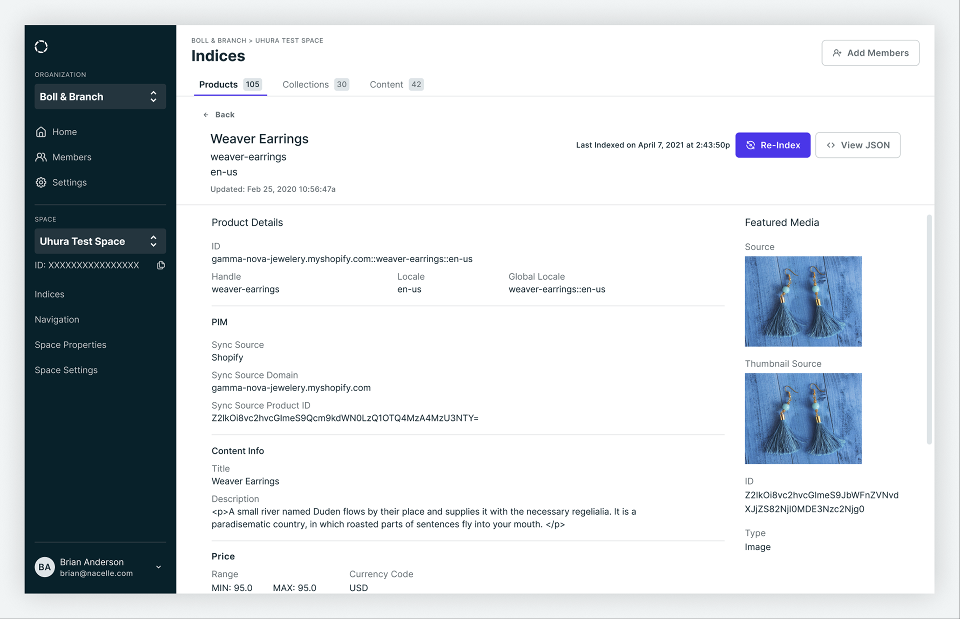
In my 18 month tenure at Nacelle, I was able to introduce an end to end UX practice, expand the UX team, and overhaul the entirety of our dashboard to give an easier, more responsive, and faster experience for our users. My north star metric for success in the dashboard was total session time, with lower numbers being a proxy for better experiences. Ultimately, the dashboard serves to connect all of the data sources, normalize the data into a single format, produce an index that exposes all of the synchronized data, and push the data to an endpoint of the merchant's choosing. Of these activities, 90+% of total usage was simply to enter our dashboard to check for index status, run re-indexes of the data, and troubleshoot any data that isn't properly synchronized. Making it such that a user can validate data accuracy and re-index as quickly as possible was desirable for both our merchants and our internal engineering teams. For merchants, it means less time on administrative tasks in their daily workflows, and for our engineering team, it necessitates a more stable and reliable system that can be better leveraged by our squads responsible for data ingestion and our outbound API. We were successful in cutting session time down by 60% in my tenure.
While there were ample struggles along the way, we made meaningful changes to how we operated internally which led to a better product for existing and future merchants. Our team had more informed decision-making, better use of developer velocity due to increased testing prior to implementation, a better understanding of our users and what outcomes they were after, and a shared vision for our product. Our merchants now have a far more reliable and usable system that is ready when they need it, but gets out of the way when they don't.
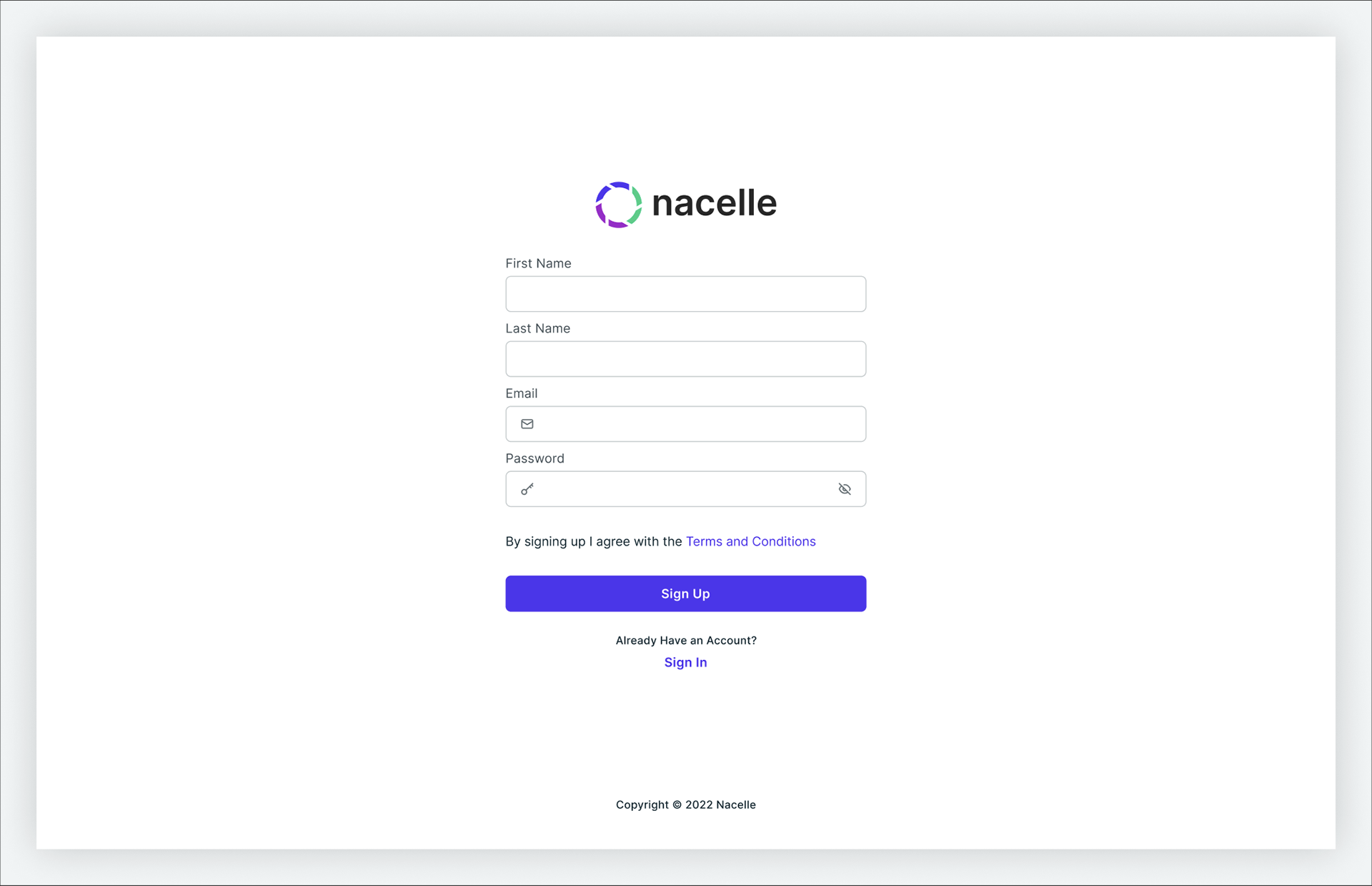
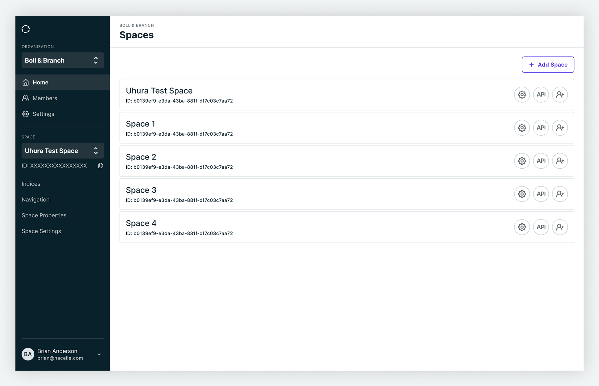
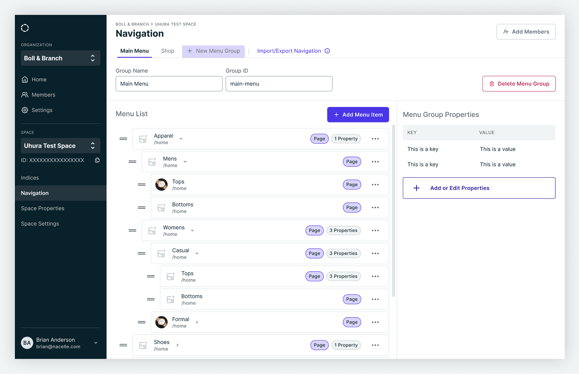
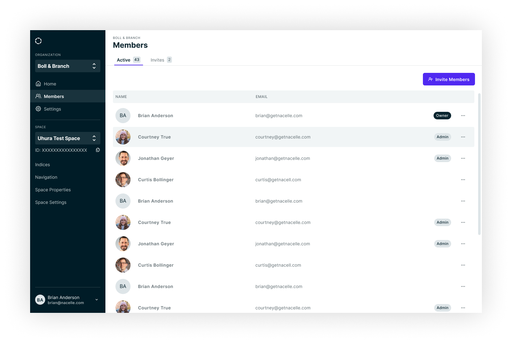
The following are a few screenshots showcasing the dashboard after a lot of collaboration, research, and design work.
