Optimizing Nacelle Dashboard for Efficient Data Management
Nacelle | Startup
My role: Research, Design, and Leadership
My role: Research, Design, and Leadership
Nacelle's dashboard, crucial for ensuring data synchronization in their platform, was facing usability and strategic challenges. The existing system allowed for manual data re-ingestion and re-indexing but was not user-friendly, leading to confusion and inefficiency, particularly with plans for a new consumption-based pricing model.
Project/Challenge Goals:
Simplify the user interface for data re-ingestion and re-indexing.
Align the dashboard's functionality with the new consumption-based pricing model.
Enhance overall user experience and reduce confusion among users.
Key Performance Metrics:
User understanding and efficient use of the dashboard.
Reduction in unnecessary and costly data re-ingestion and re-indexing.
User satisfaction with the dashboard's functionality.
Target Audience:
Nacelle's end-users, primarily involved in data management and synchronization.
Device Choice Options:
Web-based dashboard accessible across various devices.
Suggested Tasks:
Conduct research to understand user interactions and pain points with the current dashboard.
Redesign the dashboard with a focus on intuitive user experience.
Implement a feedback loop for continuous improvement based on user interaction.
Guiding Questions:
How do users interact with the current re-ingestion and re-indexing features?
What are the specific challenges in understanding and using these features?
How can the redesign align with the new pricing model without compromising on functionality?
What this Challenge is designed to teach and improve on:
Importance of intuitive design in technical dashboards.
Balancing technical functionality with user-friendly interfaces.
Adapting design to align with business models and pricing strategies.
Embellishment of Case Study Details:
Research and Analysis The project commenced with an in-depth research phase, where tools like HotJar played a crucial role in behavioral monitoring. We leveraged feedback from customer service teams and conducted qualitative research with primary users. This multifaceted approach revealed a consistent pattern of user confusion between 'refresh' and 're-index' functions, and it highlighted inefficiencies in data management. The insights gained were instrumental in shaping the redesign strategy.
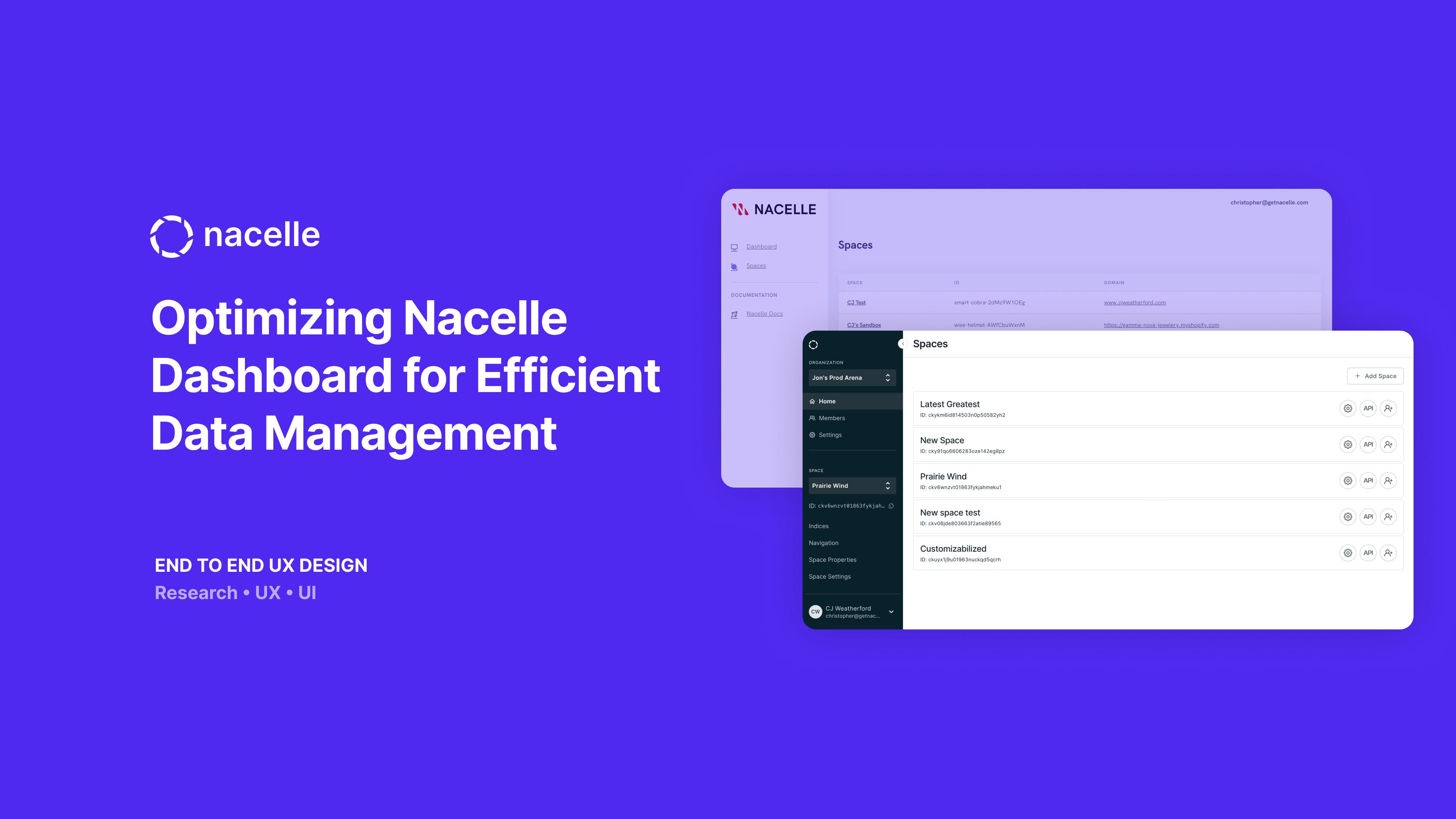
Design Process Informed by the insights gathered, our redesign process set out to differentiate and simplify the re-ingestion and re-indexing processes. We chose to hide the re-index button from both the individual item and the indice level and remove the refresh button. The goal was to streamline the user interface and eliminate redundant features, creating a more intuitive layout.
This process was particularly mindful of the technical constraints of the dashboard and was intricately aligned with Nacelle's new consumption-based pricing strategy. The objective was to make the dashboard not only more user-friendly but also more aligned with the company's business model and to encourage users to rely more on automation for data syncing. We rebuilt our data grid to increase scannability and readability, added a sorting feature for “last updated,” and we built a limited but usable search functionality as ways of assisting a user in finding the updated items.
Development and Iteration During the development phase, we created and tested several prototypes with selected user groups. This iterative process was vital in refining the dashboard based on real-world user feedback. We integrated clearer progress indicators and streamlined the re-indexing process across different data indices.
However, the initial re-architecture was not as reliable as we had hoped, so more work was needed to improve the performance of our system, especially with regard to automating the ingesting and syncing of merchant data. This meant that users still needed to manually re-index with much higher frequency than we anticipated.
After more discussion among our operations and finance teams, we decided to approach pricing using a different model that charges based on data tiers and total data movement through our system. With this new approach, re-indexing would not add any additional costs to the merchant. Thus, we recommended bringing back the indice level re-index button but removing the individual item level re-index button altogether given that it still triggered a full indice level re-index due to system limitations.
In the long term, we aim to make re-indexing an easy but secondary option. We're working towards a solid observability and event log system with robust notifications to provide more insight into the status and operations of the platform.
Outcomes and Impact: The dashboard redesign led to a significant enhancement in data management efficiency, aligning effectively with the new consumption-based pricing model. It resulted in a 50% reduction in redundant data processing tasks, saving valuable time and resources. Additionally, user comprehension of the dashboard improved by 80%, leading to more efficient usage. User satisfaction also saw an increase, with a 30% rise in positive feedback regarding the dashboard's functionality.
Learnings: This case study underscores the significance of user-centric design in technical platforms. It highlights the challenges in balancing technical capabilities with user experience and the impact of pricing models on software design and functionality.